
#8 Crypto Cockpit: Portfolio, Bitcoin & Market Regime Tabs
8 Crypto Cockpit: Start, Portfolio, Bitcoin & Market Regime Tabs
These four tabs (found at the top of the Levels panel) each give a different big-picture view: a scan of your whole coin list, your own positions, a Bitcoin-focused briefing, and an overall market read.
## Start tab
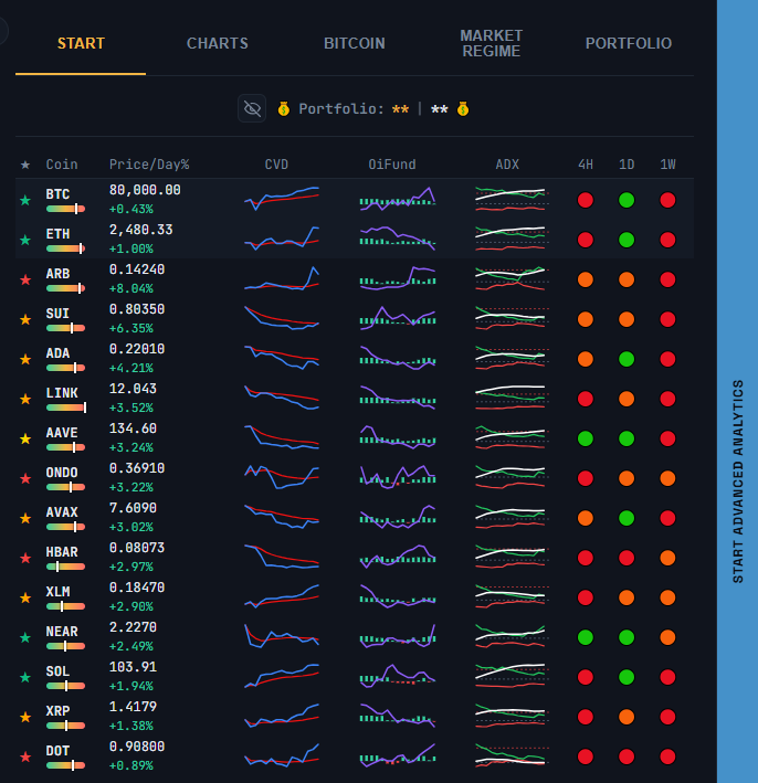
The **Start** tab is a compact, sortable-by-eye overview of every coin you track: star category, coin and S/R position, price and day %, CVD, open interest/funding, ADX, and 4H/1D/1W trend — all in one table. Your **BTC** and **ETH** rows are pinned to the top so they’re always visible while you scroll. Click any row to jump straight to that coin’s chart (on mobile this also switches you to the Chart tab).
[SCREENSHOT: The Start tab at the top]
## Portfolio tab
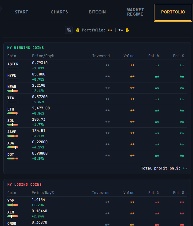
Shows three lists pulled from your Crypto Portfolio: **My Winning Coins**, **My Losing Coins**, and **Not bought yet**, each with a running total. Click a coin to jump straight to its chart. Use the eye icon at the top of the tab to mask the dollar amounts if you’re sharing your screen.
[SCREENSHOT: The Portfolio tab ]
## Bitcoin tab
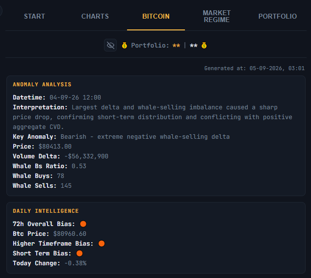
Shows an automatically generated “72H intelligence” briefing focused on Bitcoin — a written breakdown of recent conditions, refreshed periodically, with a timestamp showing when it was last generated.
[SCREENSHOT: The Bitcoin tab content]
## Market Regime tab
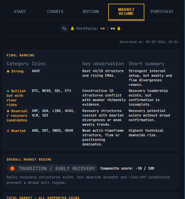
Gives an automated read of the overall crypto market, generated by the app’s analysis:
– **Final Ranking** — a table of coin categories with their key observation and a short summary, so you can see at a glance which groups of coins are leading or lagging
– **Overall Market Regime** — a badge (bullish/neutral/bearish) with a composite score out of 100 and a short summary
– **Total Market** — a score for the total market plus a breakdown of how many tracked coins currently fall into a bullish, transition/recovery, or bearish regime
– **Per-coin table** — each coin’s own regime, score, and a short reason
– **Why This Regime?** — the bull case, bear case, market breadth, Bitcoin’s role, and flow context behind the current read
– **Final Conclusion** — the best current regime, the strongest confirmation leaders, the strongest recovery zone, the clearest bearish regime, and a short summary sentence pulling it all together
[SCREENSHOT: The Market Regime tab]
Click any coin in the per-coin table to jump to its chart. This tab is about the market as a whole; for a quick regime read on just the coin you’re currently viewing, see the Regime badge described in the Indicators article, which appears when the Volume Profile window is set to “Regime”.
Two more tabs sit next to these four: **Strength** (a per-coin Buyer/Seller Strength score) and **Market Overview** (a macro/dominance dashboard) — each covered in its own article.
## A note on these tabs
The Start tab shows raw, calculated market data (price, CVD, ADX, trend, and so on) without judgment — it’s a scanning tool, not an opinion. The Bitcoin and Market Regime tabs, on the other hand, are entirely generated by the app’s automated analysis — they are not written or reviewed by a person for each update, and they are not investment advice. They describe a read of current conditions at the time they were generated, which can change quickly and can be wrong. Use them as background context, not as instructions to buy, sell, or hold.
⚠️ RISK WARNING & AI DISCLOSURE
- This information is generated by Artificial Intelligence (AI) and complex algorithms. While advanced, these systems can contain errors or inaccuracies and are for educational purposes only.
- Technical analysis provides no guarantees; this information is purely informative.
- All discussed scenarios are hypothetical and do not constitute predictions or expectations.
- Past performance is not an indicator of future results.
- This is not financial advice and is not intended as a call-to-action for the reader.
- No implicit direction is claimed, and no specific behavior of market participants is suggested.