
Understanding the Crypto Market RSI Heatmap
Overview
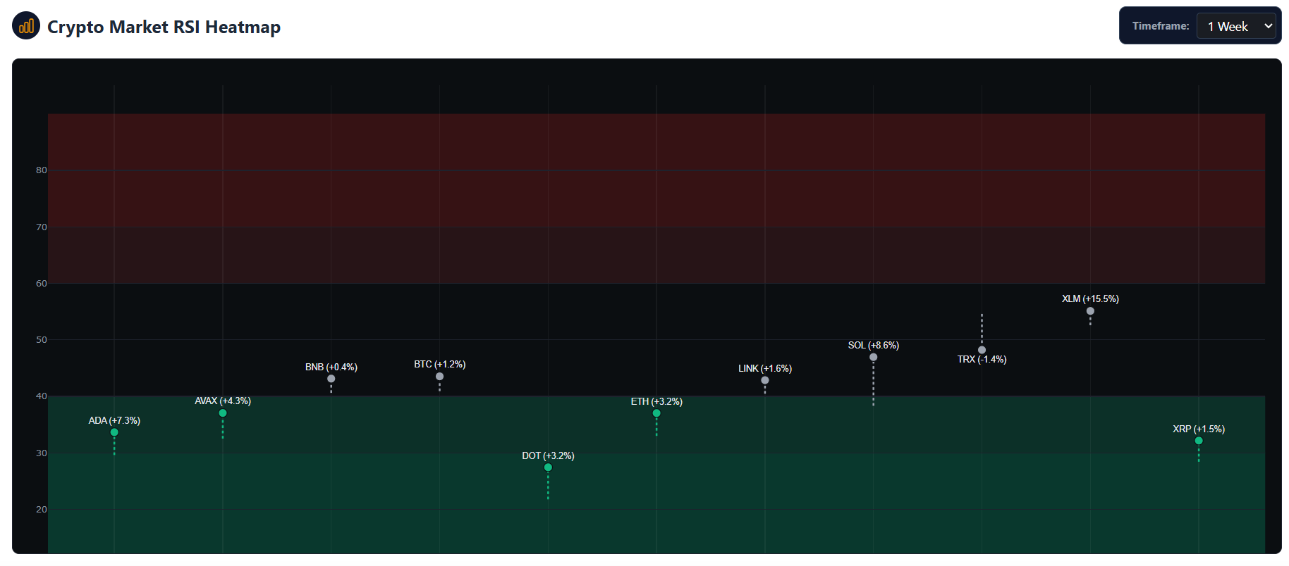
The Crypto Market RSI Heatmap is a visual trading tool designed to help you quickly assess the momentum and market sentiment of multiple cryptocurrencies at a glance. By plotting the Relative Strength Index (RSI) across different assets, this heatmap allows you to easily identify which coins are potentially overbought, oversold, or simply trending neutrally.
How to Read the Heatmap
The chart provides a snapshot of current momentum versus historical momentum, combined with recent price action. Here is what the visual elements represent:
- The Dot (Marker): Represents the current RSI of a specific cryptocurrency.
- The Text Label: Displays the coin’s ticker symbol alongside its recent price change percentage (e.g.,
BTC (+2.4%)). This percentage dynamically matches your selected timeframe. - The Dashed Line: Connects the asset’s previous RSI to its current RSI.
- If the dot is at the top of the line, RSI is rising (increasing momentum).
- If the dot is at the bottom of the line, RSI is falling (decreasing momentum).
RSI Zones & Color Coding
The Relative Strength Index fluctuates between 0 and 100. Our heatmap is divided into distinct, color-coded horizontal zones to help you interpret market conditions instantly:
🟥 Overbought Zones (Red)
- 70 to 90 (Dark Red): Overbought. The asset has experienced significant upward momentum and may be overvalued. This often signals a potential price correction, pullback, or trend reversal.
- 60 to 70 (Light Red): Strong. The asset has strong bullish momentum, but traders should exercise caution as it approaches overbought territory.
⬛ Neutral Zone (Black/Gray)
- 40 to 60 (Dark Background): Neutral. The asset is in a standard consolidation phase or maintaining a steady, moderate trend without extreme momentum in either direction.
🟩 Oversold Zones (Green)
- 30 to 40 (Light Green): Weak. The asset is experiencing strong bearish momentum, but selling pressure may be nearing exhaustion.
- 10 to 30 (Dark Green): Oversold. The asset has faced heavy selling and may be undervalued. This zone frequently signals a potential price bounce or bullish reversal.
Customizing Your View
Changing Timeframes
You can adjust the timeframe of the heatmap using the dropdown menu (e.g., 1W for Weekly, 1D for Daily).
Important note on timeframes: Changing this setting updates both the RSI calculation and the price change percentage label. For example, selecting the 1W timeframe will display the 14-week RSI and the 7-day price percentage change, giving you a broader macroeconomic view. Selecting 1D will display the 14-day RSI and the 24-hour price change for short-term trading.
Practical Use Cases
- Spotting Reversals: Look for coins deep in the Dark Red or Dark Green zones. These are prime candidates for potential trend reversals.
- Confirming Breakouts: If a coin breaks a resistance level on the price chart while moving from the Neutral zone into the Light Red (Strong) zone, it confirms strong buying interest.
- Avoiding Traps: If a coin is pumping hard but is already sitting at an 85 RSI (Dark Red), the heatmap warns you that buying in now carries a high risk of an imminent pullback.
⚠️ RISK WARNING & AI DISCLOSURE
- This information is generated by Artificial Intelligence (AI) and complex algorithms. While advanced, these systems can contain errors or inaccuracies and are for educational purposes only.
- Technical analysis provides no guarantees; this information is purely informative.
- All discussed scenarios are hypothetical and do not constitute predictions or expectations.
- Past performance is not an indicator of future results.
- This is not financial advice and is not intended as a call-to-action for the reader.
- No implicit direction is claimed, and no specific behavior of market participants is suggested.