How to ready Orderflow Charts?
This is an impressive dashboard that looks much deeper than just the price. You are looking “under the hood” of the Bitcoin market here. Where a normal chart only shows the end result of a fight, this shows how the fight is being fought, by whom, and with how much ammunition.
Here is my analysis of this Orderflow Snapshot (based on the daily, 1d timeframe), broken down by section, followed by the conclusion.
Analysis per Chart
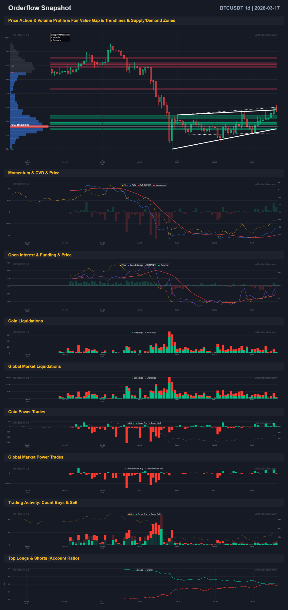
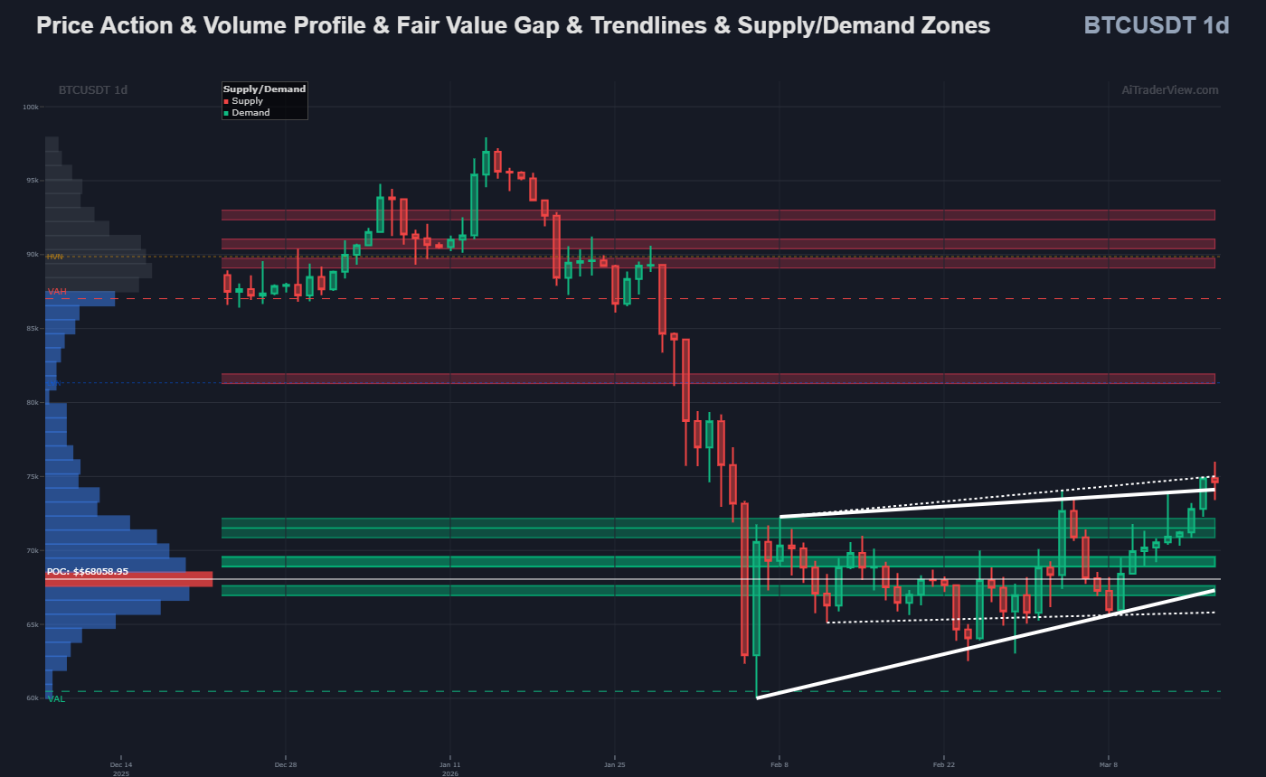
- Price Action & Volume Profile & Zones: The price took a significant dive and is now in a consolidation phase (an ascending wedge or channel). The price is making higher lows, which is positive. On the left, you see the Volume Profile. The red line (Point of Control – POC) is far below the current price. This means that most historical trading took place lower, which now acts as strong support. However, the price is currently colliding directly with a solid red “Supply Zone” (resistance) and the top of the pattern.
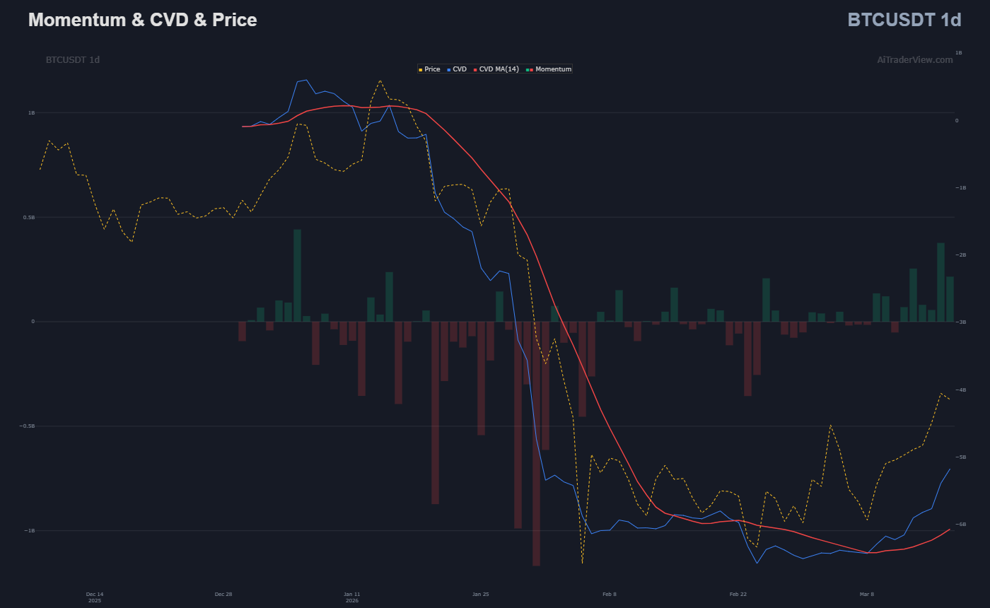
- Momentum & CVD (Cumulative Volume Delta) & Price: CVD measures the net difference between aggressive buying and selling. After a sharp decline in the CVD during the crash, we see the lines flattening out and slowly starting to rise. The recent green bars indicate that buying momentum is returning on the daily chart. Sellers are becoming exhausted.
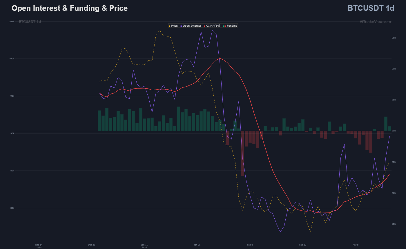
- Open Interest & Funding & Price: Open Interest (OI) shows the number of outstanding derivative contracts. During the drop, the OI was flushed out (people were thrown out of their positions). Now you can see the OI slowly rising again as the price rises. This means that fresh capital is flowing into the market to support this upward movement.
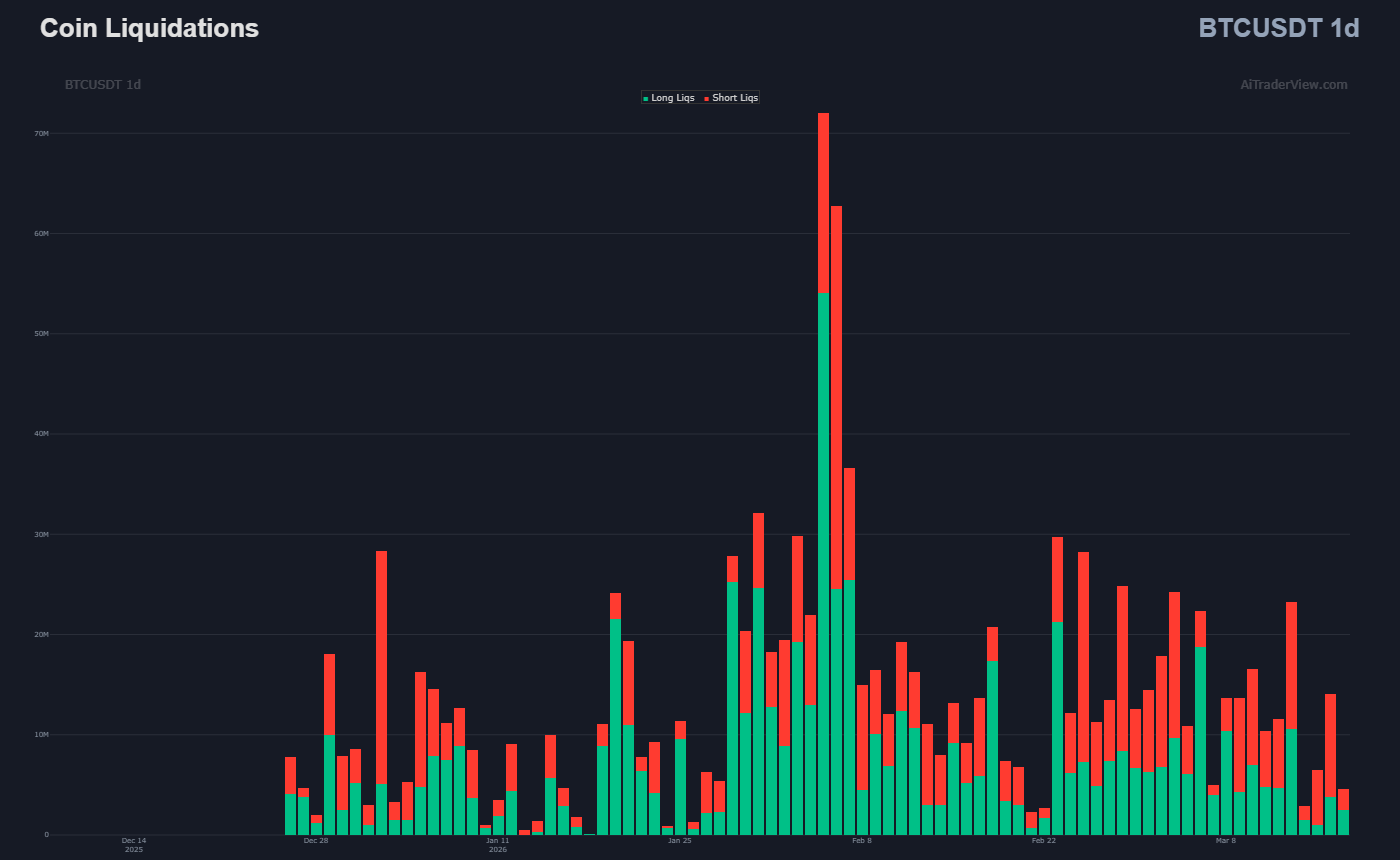
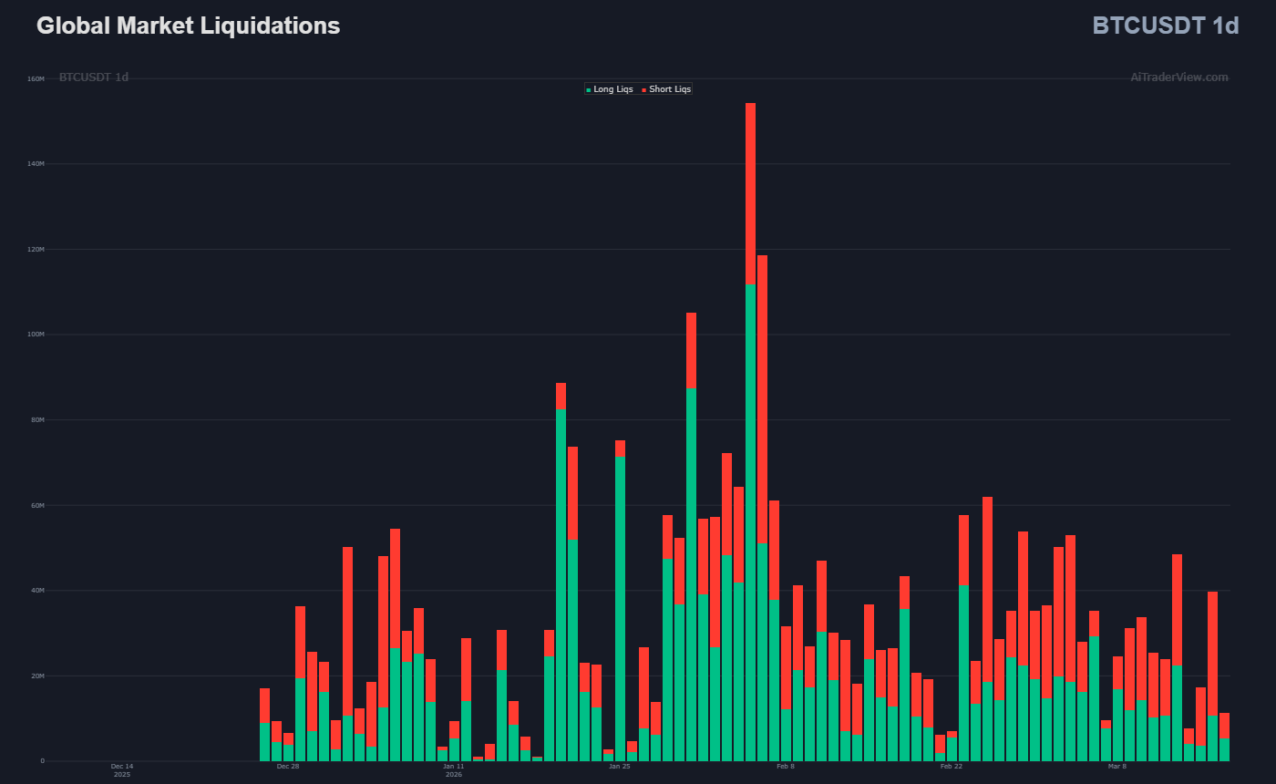
- Coin & Global Market Liquidations: These two charts are crucial. The massive red towers in the past show that “longs” (people betting on a price increase) were liquidated en masse during the drop. The market has been “flushed clean.” Recently, we are seeing smaller green bars appear. This means that “shorts” (people betting on a price decrease) are now slowly coming under pressure and getting stopped out, which pushes the price up (a mini short-squeeze).
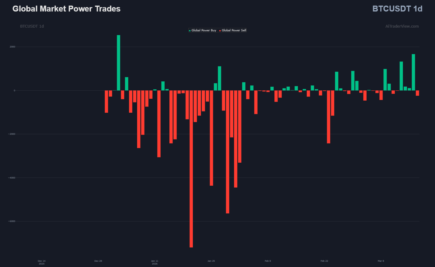
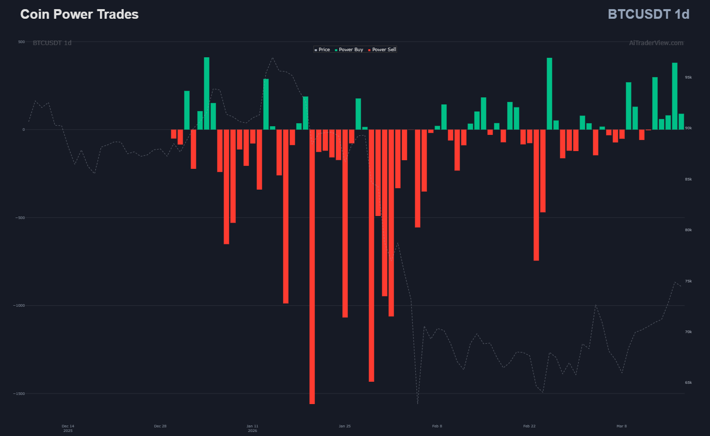
- Coin & Global Market Power Trades: Power trades reveal the big players (whales/institutions). During the crash, large sell orders dominated (large red bars below the zero line). On the right side of the chart, we see that the selling pressure has stopped and small, yet present, green buy orders are taking its place. The major players have stopped dumping.
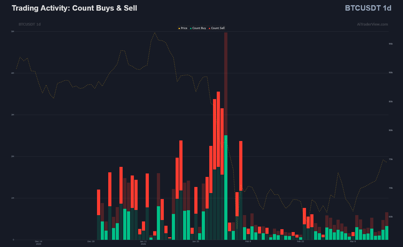
- Trading Activity (Count Buys & Sells): Trading activity was massive during the volatility but has now subsided. This is typical for a consolidation phase. The number of buyers and sellers is currently balancing each other out, with a slight preference for buyers recently.
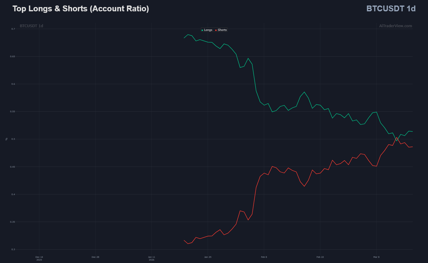
- Top Longs & Shorts (Account Ratio): This shows the positioning of top traders. You can see the balance slowly shifting back. After a period where shorts dominated, longs are beginning to gain ground again.
What do you see here that you don’t see in a normal candlestick chart?
A standard candlestick chart only shows Open, High, Low, Close (OHLC) and simple volume. It tells you what happened. This order flow dashboard tells you why it is happening:
- Intention (CVD & Power Trades): A green candle on a normal chart can be caused by low volume in an empty market. Here, you can see whether that green candle was driven by aggressive, large market buys (whales) or by passive behavior.
- Leverage (Liquidations & Open Interest): You can see where traders are trapped. The massive liquidations show that the market was overheated and has been reset. You don’t see that on a bare chart.
- Hidden Support/Resistance (Volume Profile): Normal charts use old price points as resistance. The Volume Profile (the blue/grey histogram on the left) shows the exact price levels where the big money was actually exchanged.
Conclusion: Is it Bullish or Bearish?
Based on this data, the picture is currently cautiously bullish, with a caveat for the short term.
- Why Bullish? Over-leveraged longs have been flushed out, smart money (power trades) has stopped selling and is starting to accumulate, the CVD is turning upward, and new money is entering the market (rising Open Interest). The structure shows higher lows.
- The Caveat: The price is currently right up against a solid “Supply Zone” (resistance) and the top of the pattern.
In summary: The underlying data (the engine) looks very healthy and upward-trending after a significant reset. As soon as the price breaks through the current red resistance zones, the path is clear for a substantial rally, partly driven by shorts that will then be liquidated en masse. If the breakout fails, the strong green demand zones below will likely catch the price.
⚠️ RISK WARNING & AI DISCLOSURE
- This information is generated by Artificial Intelligence (AI) and complex algorithms. While advanced, these systems can contain errors or inaccuracies and are for educational purposes only.
- Technical analysis provides no guarantees; this information is purely informative.
- All discussed scenarios are hypothetical and do not constitute predictions or expectations.
- Past performance is not an indicator of future results.
- This is not financial advice and is not intended as a call-to-action for the reader.
- No implicit direction is claimed, and no specific behavior of market participants is suggested.