Bitcoin Anomaly Detector
Guide: AI Anomaly & Market Insight Dashboard
This module provides a real-time X-ray of the market. It combines advanced AI pattern recognition with hard order flow data to instantly visualize abnormal behavior (anomalies).
This article explains how to read the interface, what the signals mean, and how to interpret the charts.
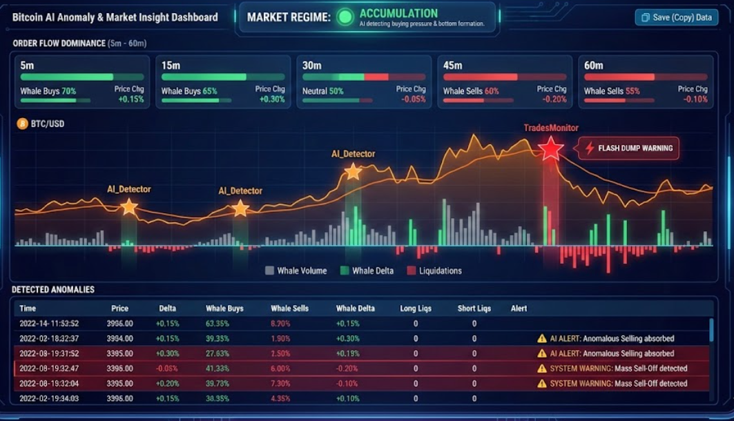
1. Market Regime (Market Status)
At the top of the screen, you can immediately see the current “psychological state” of the market. The AI continuously analyzes recent price action and volume flows to determine which phase the market is in:
- 🟢 ACCUMULATION: The AI detects buying pressure being absorbed by the market. Often a sign of bottom formation or preparation for a rise.
- ⚪ NEUTRAL: The market is balanced or moving sideways without a clear direction.
- 🔴 DISTRIBUTION: Large players are likely selling (taking profit) while the price stagnates or drops. This is often a warning sign for a correction.
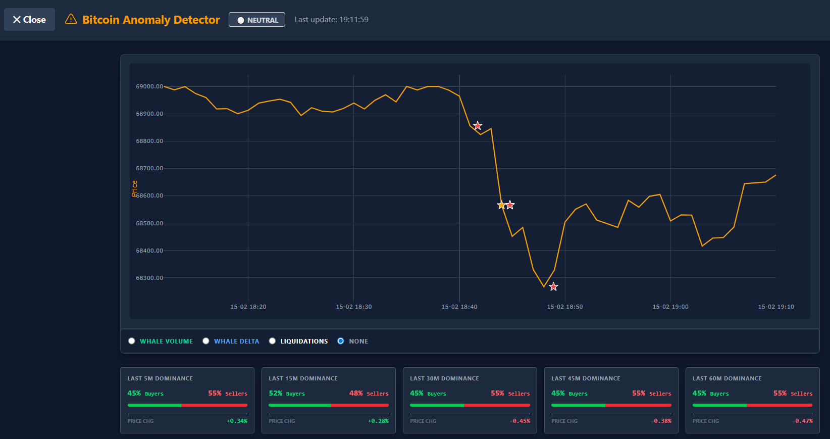
2. Order Flow Dominance (5m – 60m)
Below the status bar, you will find five cards showing the battle between buyers and sellers across different timeframes (5, 15, 30, 45, and 60 minutes).
- The Bar: Shows the ratio between Whale Buys (Green) and Whale Sells (Red).
- Example: If the bar is 70% green, large buyers are dominating the volume in that period.
- Price Chg: The percentage by which the price has changed during that period.
- Divergence Tip: If you see Dominance is heavily red (lots of selling), but the Price Chg remains stable or rises, this may indicate absorption (bullish).
3. The Anomaly Chart
The chart displays the price action (orange line) combined with visual warnings and selectable overlays.
The Stars (Signals)
Sometimes stars appear on the price line. These are moments when the system intervenes:
- ⭐ Orange Stars (AI_Detector): These are signals from the Artificial Intelligence. The AI has detected behavior here that is “abnormal” for current market conditions. This doesn’t necessarily mean a crash, but can indicate manipulation, hidden walls, or exhaustion.
- Example: Price is rising, but the AI sees unusual patterns in liquidations or whale activity that don’t match a healthy trend.
- ⭐ Red Stars (TradesMonitor): These are critical system warnings based on hard data. Think of extreme events like a “Flash Dump”, “God Candle”, or massive sell-offs exceeding a preset limit.
Chart Overlays (Selectable top right)
You can overlay extra data on the price chart to see the cause of a movement:
- Whale Volume: Shows gray/colored bars indicating how much volume is being traded by large players (“Whales”). High bars mean significant interest from big money.
- Whale Delta: Shows the net difference between Whale buy and sell volume.
- Green bar: Whales are aggressively buying net more.
- Red bar: Whales are aggressively selling.
- Liquidations: Shows where traders were “forced” out of their positions.
- Red bars (Long Liqs): Traders betting on a rise were liquidated (painful, often fuel for a drop).
- Green bars (Short Liqs): Traders betting on a drop were liquidated (fuel for a short squeeze up).
4. Table: Detected Anomalies
Below the chart, you will find a detailed log of every minute and every alarm.
The Columns:
- Price: The closing price of that minute.
- Delta: The difference between buy and sell volume.
- Whale Buys/Sells: The volume specifically coming from large orders.
- Whale Delta: The net result of the whales (are they net buyers or sellers?).
- Long/Short Liqs: The value of the liquidations.
Special Rows (Highlighted Red): When there is an ⚠️ AI ALERT or system warning, a red row appears in the table. Here you read the exact reason for the alarm, for example:
- “Anomalous Selling absorbed” (Selling is happening, but price isn’t dropping -> Bullish).
- “Buying hitting wall” (Buying is happening, but price isn’t rising -> Bearish).
5. Exporting Data
Do you want to analyze the data further in Excel or share it with a team?
- Save (Copy) Button: Click this button above the table. All visible data is immediately copied to your clipboard in a format you can paste directly into a spreadsheet (like Excel or Google Sheets).
Summary for use
- Look at Market Status for the general trend.
- Check the Dominance cards to see who owns the last 15-60 minutes.
- Watch for Stars in the chart for abnormal behavior.
- Use the Table to confirm if a move is backed by ‘real’ Whale volume.
⚠️ RISK WARNING & AI DISCLOSURE
- This information is generated by Artificial Intelligence (AI) and complex algorithms. While advanced, these systems can contain errors or inaccuracies and are for educational purposes only.
- Technical analysis provides no guarantees; this information is purely informative.
- All discussed scenarios are hypothetical and do not constitute predictions or expectations.
- Past performance is not an indicator of future results.
- This is not financial advice and is not intended as a call-to-action for the reader.
- No implicit direction is claimed, and no specific behavior of market participants is suggested.