Orderflow: Orderbook Heatmap, CVD, Momentum, Open Interest, Funding, Liquidations, Powertrades, Fair Value Gap & Trendlines!
Analyzing Market Mechanics: The Orderflow Module
Most standard technical analysis focuses on candlesticks (price history), but price movement is often the result of underlying order execution. To understand these market mechanics, analysts use Orderflow Trading.
AiTraderView’s Orderflow module is a professional-grade visualization tool designed to display the raw transactional data driving the market, including Volume, Liquidations, Open Interest, Momentum, CVD, Funding, and Large Trade Blocks.
In this article, we break down how to utilize this feature to analyze market depth and liquidity.
What is Orderflow Analysis?
Orderflow Analysis is the study of actual executed buy and sell orders. Unlike standard indicators (like MACD or RSI) which are often derived from past price action, orderflow data is real-time and transactional.
By analyzing the flow of orders, users can assess:
- Aggression: Are buyers (ask side) or sellers (bid side) executing more aggressively?
- Structure: Is price movement supported by volume, or is it driven by derivative liquidations?
- Market State: Where have significant liquidations occurred?
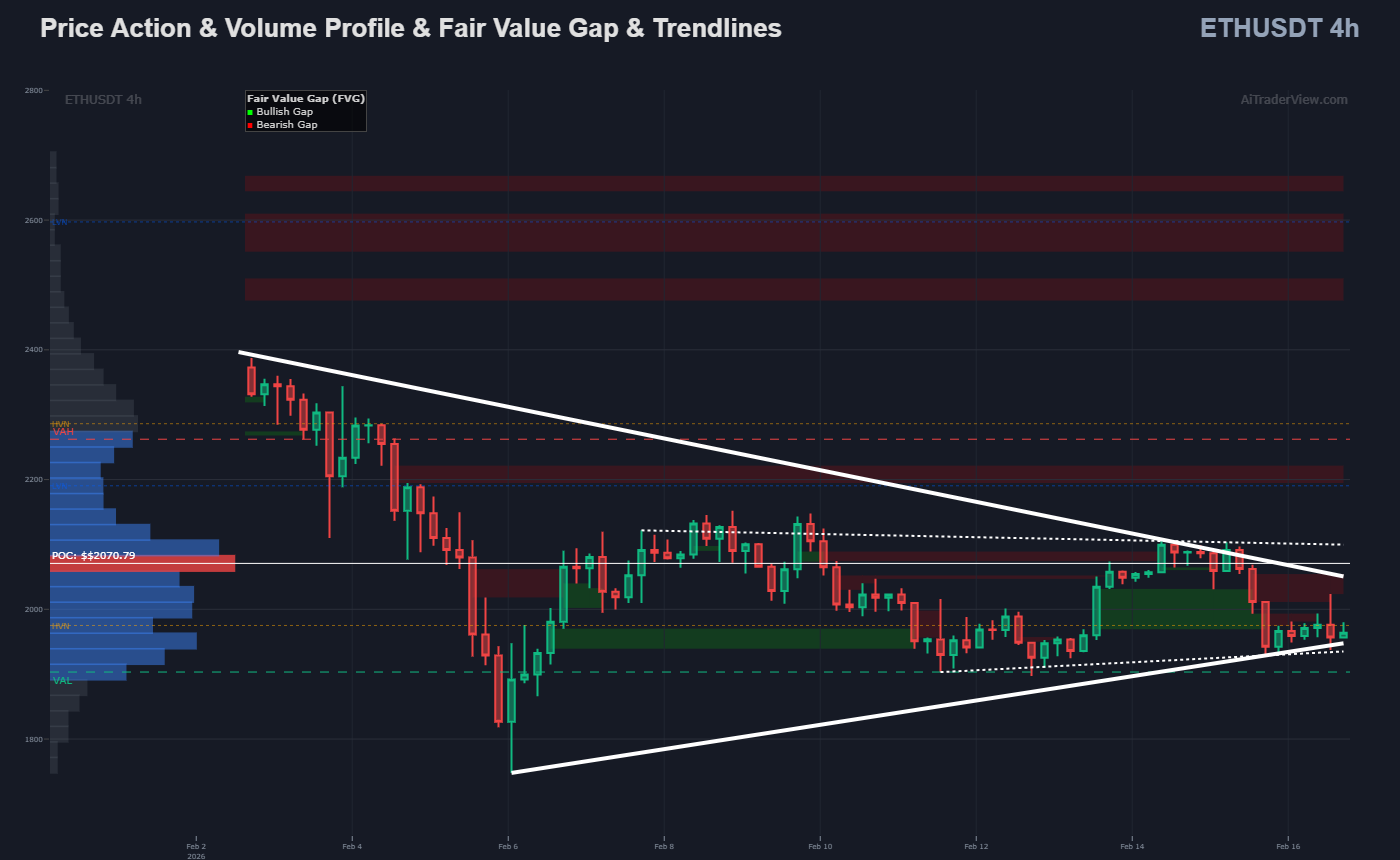
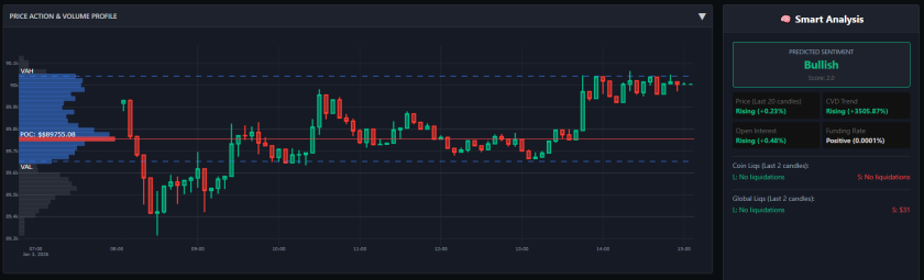
1. Price Action & Volume Profile (VPVR)
The main chart in the Orderflow popup combines standard candlesticks with a Volume Profile Visible Range (VPVR) overlay.
Instead of showing volume over time (vertical bars), the VPVR displays volume at price (horizontal bars). This assists in identifying areas of high and low liquidity:
- POC (Point of Control): The red line represents the price level with the highest traded volume within the visible range. In auction theory, this is often viewed as a level of “fair value” or high agreement.
- VAH / VAL (Value Area High/Low): These lines define the range where 70% of the trading activity occurred. Moving outside this area is statistically significant in volume profile analysis.
2. The Orderbook Heatmap: Visualizing Liquidity Depth
For users seeking deeper market transparency, the Orderflow module includes a specific feature toggle: “Heatmap Enabled.”
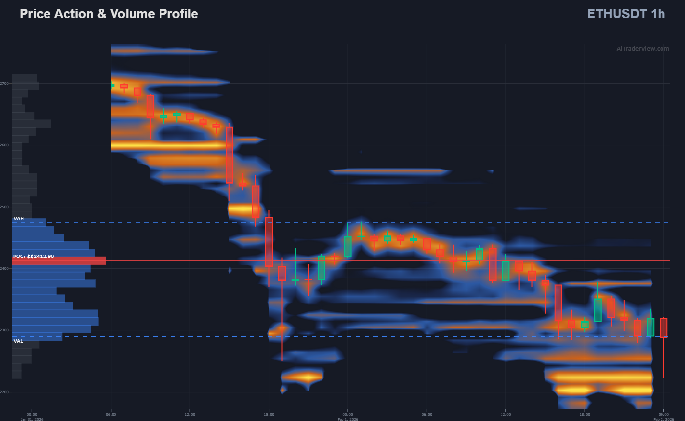
Activating this checkbox overlays a Historical Orderbook Heatmap onto your chart (comparable to industry standards like the Coinglass Model 3). While standard candlesticks show where the price has been, the Orderbook Heatmap visualizes where pending orders are waiting.
How it Works: This tool visualizes the Limit Order Book (LOB). It tracks pending Buy (Bid) and Sell (Ask) orders that are sitting in the order book but have not yet been filled.
- Color Intensity: The chart uses a color spectrum to represent liquidity density.
- Bright Colors (e.g., Yellow/Red): Indicate a high concentration of limit orders (often referred to as “Buy Walls” or “Sell Walls”).
- Dark/Cold Colors: Indicate areas of low liquidity or “thin” order books.
Analytical Utility:
- Identifying Structure: Significant resting liquidity often acts as a form of “passive” support or resistance. Traders monitor these bright zones to see if price reacts to large order blocks.
- Spotting “Spoofing”: By observing the heatmap over time, analysts can see if large orders are real (filled) or if they disappear as the price approaches (potentially indicating “spoofing” or fake demand).
- Liquidity Magnets: In auction theory, price often gravitates toward areas of high liquidity to facilitate trade execution. The heatmap makes these potential target zones visible.
3. Liquidations: Volatility Drivers
The dashboard features two dedicated charts for liquidations: Coin Liquidations and Global Market Liquidations.
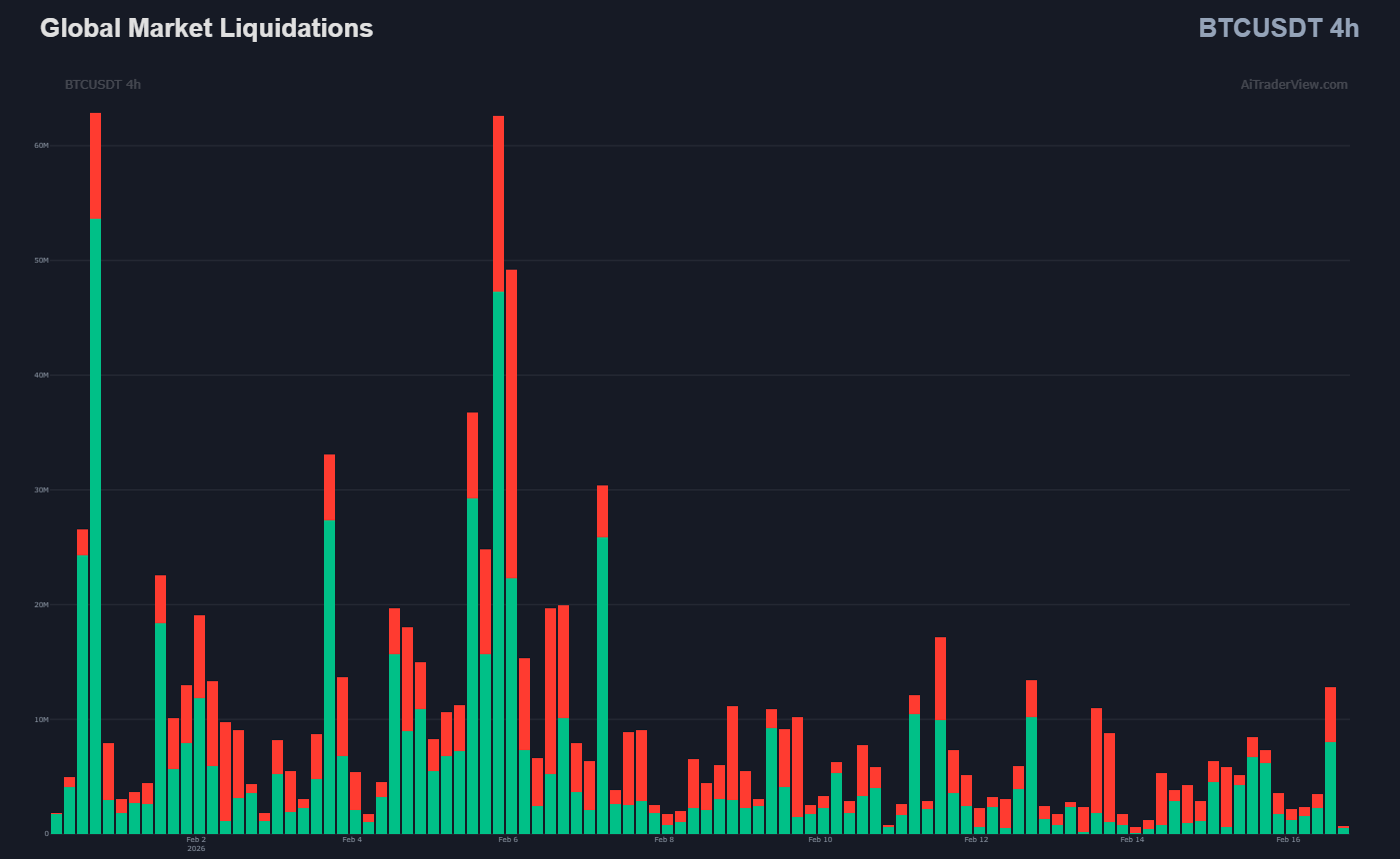
Context: Liquidations represent “forced orders.” When a leveraged position is liquidated, the exchange automatically executes a market order to close the position.
- Long Liquidations (Green bars): Long positions are forced to sell. Significant spikes here may indicate “Long Flushes.”
- Short Liquidations (Red bars): Short positions are forced to buy. Significant spikes here are often associated with “Short Squeezes.”
Utility: Monitoring these bars allows analysts to see where leverage is being flushed from the market, which is often a precursor to volatility stabilization.
4. Momentum & CVD (Cumulative Volume Delta)
The “Momentum & CVD” chart is a critical component of Orderflow analysis.
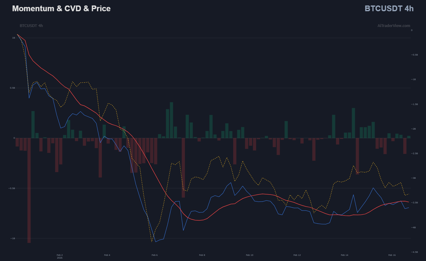
- Net Volume (Bars): Shows the raw difference between buying and selling volume for each candle.
- CVD (Blue Line): The Cumulative Volume Delta tracks the aggregate buying vs. selling pressure over time.
Concept: Divergence Analysis Traders often look for discrepancies between Price and CVD.
- Example: If Price makes a New High, but CVD makes a Lower High, this is technically interpreted as “Absorption” (buying pressure is fading despite rising price).
5. Open Interest (OI) & Funding Rates
This chart displays Open Interest and Funding Rates.
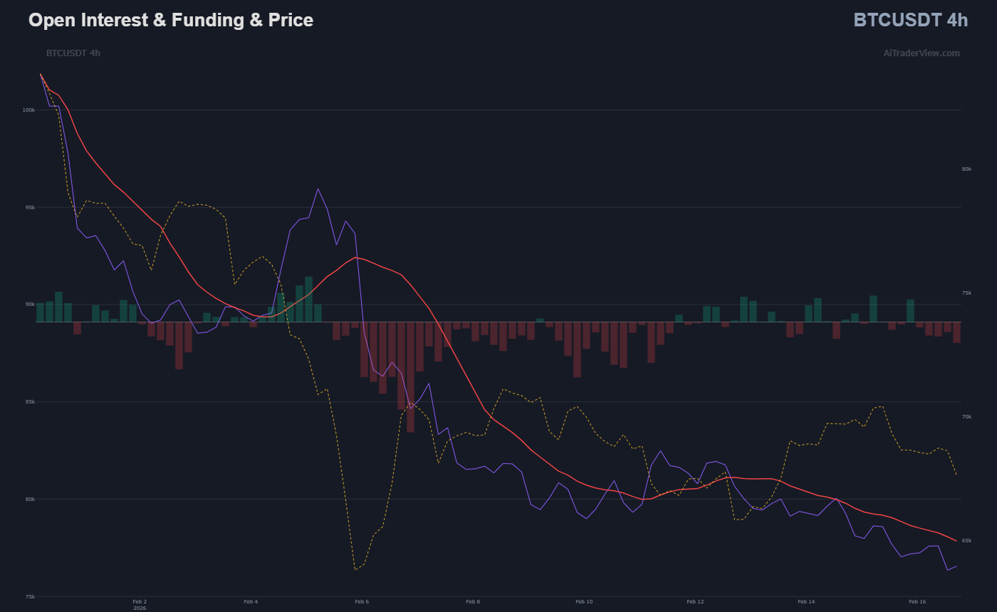
- Open Interest (Area): The total number of open derivative contracts.
- Rising Price + Rising OI: Often interpreted as a trend supported by new capital entry.
- Rising Price + Falling OI: May indicate a trend driven by short-covering rather than new long demand.
- Funding Rate: The periodic payment exchanged between long and short traders. High positive funding rates indicate that the majority of the market is positioned Long, while negative rates indicate a Short bias.
6. Power Trades: Analyzing Large Orders
The Power Trades section (available for specific coins and the Global Market) filters the order stream to highlight high-value transactions.
- Power Delta (Bars): This shows the net difference between large-scale buy orders and sell orders.
- Volume Significance: A spike in Global Power Trades during a consolidation period may indicate activity from larger market participants (institutions or large volume traders).
- Global Context: Analyzing Global Power Trades helps determine if a move in a specific asset is idiosyncratic or part of a broader market shift.
7. Trading Activity: Trade Count vs. Volume
While volume measures value traded, the Count Trades chart measures the frequency of transactions.
- Order Size Analysis: High volume accompanied by a low trade count suggests that fewer, larger orders are driving price. Conversely, a high trade count with low volume often suggests retail-driven activity.
- Delta Dominance: The bars are color-coded to show which side (Buy vs. Sell) is initiating the most transactions.
8. Long/Short Account Ratio
This chart tracks the sentiment of top traders (Account Ratio).
- Top Trader Sentiment: It displays the ratio of accounts holding net long positions versus net short positions on major exchanges.
- Sentiment Analysis: This is often used as a contrarian indicator. For example, if an overwhelming majority (e.g., 80%) of accounts are Long, but price fails to rise, analysts may monitor for a potential liquidation cascade.
9. Fair Value Gaps (FVG): Automated Imbalance Detection
For price action traders, the Orderflow module now includes an algorithmic Fair Value Gap (FVG) detector overlaid directly on the main chart.
What is an FVG? A Fair Value Gap represents a price imbalance—a range where the market moved so aggressively that little to no trading occurred at those specific price levels. The software identifies these using a strict three-candle sequence:
- Bullish FVG (Green Zone): Occurs when the High of the first candle remains lower than the Low of the third candle. This visually represents a “vacuum” of buy-side liquidity that price may revisit.
- Bearish FVG (Red Zone): Occurs when the Low of the first candle remains higher than the High of the third candle, indicating a sell-side imbalance.
Dynamic Mitigation (Smart Filling) Unlike static drawing tools, the AiTraderView FVG engine is dynamic.
- Real-Time Adjustments: If price action re-enters a gap (a process known as “filling” or “mitigation”), the visual box automatically shrinks to reflect the remaining unfilled range.
- Auto-Removal: Once price completely closes through a gap, the indicator removes the zone entirely, ensuring your chart remains cluttered only with active, relevant data.
Utility: Traders use these zones as high-probability targets (magnets) where price often returns to restore balance before continuing a trend.
10. Auto Trendlines: High-Sensitivity Structure Detection
Market structure is often defined by diagonal support and resistance, yet drawing these lines manually introduces human bias. The Orderflow module now includes an Auto Trendline engine to objectively map price channels.
- Algorithmic Pivot Detection: Instead of guessing, the system scans historical candles to identify mathematically significant pivot highs and lows. It then calculates the most efficient linear vectors that price has respected over time.
- Dynamic Sensitivity: The algorithm adjusts its tolerance based on the selected timeframe. It is designed to filter out “noise” (wicks) while locking onto valid structural touches.
- Dual-Layer Analysis:
- Primary Trends (Solid Lines): Represents the dominant directional trend (long-term structure).
- Secondary Trends (Dotted Lines): Highlights emerging local structures or steeper accelerating trends.
- Utility: This feature allows traders to instantly spot Breakout or Rejection points. When combined with the Heatmap, a Trendline intersection with a Liquidity Wall acts as a high-confluence zone for potential reversals.
11. 🧠 Automated Data Summary
The sidebar provides an algorithmic summary of the current market state based on a specific lookback period.
- Trend Aggregation: Automatically calculates the trend direction and percentage change for Price, CVD, and Open Interest simultaneously.
- Funding Status: Provides a quick-reference visual for the current Funding Rate status (Neutral, Premium, or Discount).
- Snapshot Liqs: Displays the specific dollar amount of liquidations for the last two candles, providing immediate data on recent market impact.
12. Fully Customizable Workspace
The Orderflow dashboard is a dynamic environment designed for efficiency:
- Smart Integration: Use the quick-action icons to navigate directly to AI Technical Analysis (🤖) or the Summary Module (🛒).
- Drag & Drop: Every chart section is modular. Users can reorder charts (e.g., placing CVD at the top) to suit their analysis workflow.
- Vertical Resizing: Charts can be scaled vertically to emphasize specific data sets.
How to Access the Orderflow Dashboard
- Click the “⚔️ Orderflow” button in the quick menu or task list.
- The popup will load the current symbol (e.g., BTCUSDT) automatically.
- Use the dropdown at the top to switch between assets.
- Adjust the timeframe to match your analysis horizon.
Conclusion
Orderflow Analysis adds a layer of depth to technical strategy. Instead of relying solely on support levels holding, analysts can monitor CVD and Liquidations to observe real-time market participation.
By utilizing the pillars of this dashboard, users can transition from simple price observation to a comprehensive analysis of market structure.
⚠️ RISK WARNING & AI DISCLOSURE
- This information is generated by Artificial Intelligence (AI) and complex algorithms. While advanced, these systems can contain errors or inaccuracies and are for educational purposes only.
- Technical analysis provides no guarantees; this information is purely informative.
- All discussed scenarios are hypothetical and do not constitute predictions or expectations.
- Past performance is not an indicator of future results.
- This is not financial advice and is not intended as a call-to-action for the reader.
- No implicit direction is claimed, and no specific behavior of market participants is suggested.