Heatmap: Support & Resistance
Visualizing Market Structure: The Support and Resistance Heatmap
In fast-paced markets, manually plotting support and resistance lines can be time-consuming and subjective. The Support and Resistance Heatmap is designed to solve this by aggregating critical data points—such as daily levels, weekly levels, Points of Control (POC), and Golden Pockets—and visualizing them as a dynamic heat zone overlaying the candlestick chart.
In this article, we explain the technical functioning of the Support and Resistance Heatmap, how the algorithm calculates the “heat” intensity (confluence), and how this data can be utilized to identify key areas of interest.
What is the Support and Resistance Heatmap?
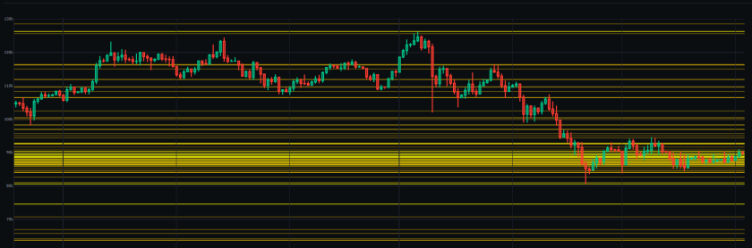
The Support and Resistance Heatmap is a specialized visualization tool within AiTraderView. Rather than displaying single lines for support or resistance, it generates colored horizontal zones based on the density of confluence.
- Visual Logic: When multiple technical levels cluster at a specific price point, the heatmap displays a brighter, more opaque zone. Conversely, areas with less technical confluence appear fainter.
- Utility: This visual distinction assists users in differentiating between minor intraday levels and major structural zones where multiple technical indicators overlap.
How to Access the Heatmap
Accessing this tool is straightforward from the dashboard:
- Click on the “🔥 Heatmap: Support & Resistance” button or the corresponding icon in the tasks menu.
- A full-screen popup overlay will appear.
- The tool automatically loads the chart for the selected symbol (e.g., BTCUSDT).
The popup is designed to isolate the price action against the heatmap layers for focused analysis.
How the Algorithm Calculates “Heat”
Understanding the logic behind the color intensity is essential for interpreting the data. The software utilizes a Weighted Scoring System to determine the opacity of each zone. It does not predict price, but rather highlights the strength of the technical confluence.
The Internal Weighting Logic: The algorithm assigns a specific “Weight” to every level it detects:
- Standard Weight: Basic pivot points receive a standard score.
- Higher Weight (+1): Higher timeframe levels—Daily (1d), Weekly (1w), and Monthly (1m)—are weighted more heavily, resulting in a brighter zone.
- Significant Weight (+2): Previous swing points and historical levels add significant intensity to the heatmap.
- Maximum Weight (+3): Major technical levels, such as the Point of Control (POC), Golden Pockets, and 0.618 Fibonacci levels, generate the highest intensity zones.
Interpretation: A bright yellow or orange band on the chart indicates a zone where multiple high-weight factors (e.g., a Weekly Level + a Golden Pocket) overlap. In technical analysis, such areas are often monitored for potential market reaction.
Navigating the Interface
The Support and Resistance Heatmap interface offers several controls for customization:
- Symbol Navigation: Switch between assets using the “Prev” (⏮️) and “Next” (⏭️) buttons.
- Live Data: The header displays the live price and the 24-hour percentage change.
- Timeframe & Range: Users can adjust the candle timeframe (e.g., 15m, 1h, 4h) and the analysis range percentage to focus on specific market segments.
Analyzing the Data Table
Below the visual chart, the tool provides a detailed text-based breakdown. This table lists “All Supports & Resistances” sorted by price, offering granular data to complement the visual heatmap.
Table Columns:
- Label: The type of technical level (e.g., “Weekly (1w)”, “Golden Pocket”).
- Price: The specific price point to the decimal.
- % Diff: The percentage distance of the level from the current live price.
Live Anchor: The row highlighted in blue represents the current price, serving as an anchor point to easily visualize resistance levels (above) and support levels (below).
Conclusion
The Support and Resistance Heatmap functions as a density map of market structure. By visualizing where standard levels, Fibonacci zones, and time-based pivots overlap, users can objectively assess the technical landscape.
Educational Application: In standard technical analysis theory, a bright resistance zone represents a high concentration of supply. Traders often use this data to inform risk management decisions, such as avoiding long entries directly into areas of heavy technical resistance. The heatmap provides the data to make these assessments efficiently.
⚠️ RISK WARNING & AI DISCLOSURE
- This information is generated by Artificial Intelligence (AI) and complex algorithms. While advanced, these systems can contain errors or inaccuracies and are for educational purposes only.
- Technical analysis provides no guarantees; this information is purely informative.
- All discussed scenarios are hypothetical and do not constitute predictions or expectations.
- Past performance is not an indicator of future results.
- This is not financial advice and is not intended as a call-to-action for the reader.
- No implicit direction is claimed, and no specific behavior of market participants is suggested.