Standard Charts & Indicators
Market Overview: Standard Charts & Indicators
This dashboard tab is designed to provide a comprehensive overview of current market conditions. By combining price structure with momentum and trend strength indicators, this interface assists analysts in assessing directional bias, energy (volatility), and trend reliability.
Below is a breakdown of the standard charts and indicators found in this module.
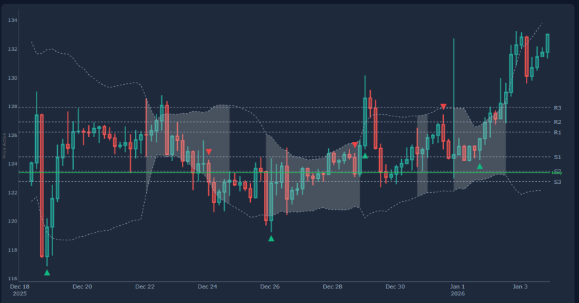
1. The Price Action Chart: Squeeze & Pivot Points
The main chart displays price candles overlaid with two primary tools for structural analysis.
S1, S2, S3 & R1, R2, R3 (The Levels) These lines represent automatically calculated Support and Resistance zones (derived from Pivot Point formulas). They serve as technical boundaries for price movement.
- S1, S2, S3 (Support): Zones where price has statistically higher probability of encountering demand. S3 often represents an extreme statistical deviation.
- R1, R2, R3 (Resistance): Zones where price may encounter supply. R1 is often used as a preliminary target, while R3 represents potential exhaustion.
- Note: Technical theory suggests that when Resistance is breached (e.g., R1), the level may flip to become new Support (Polarity Flip).
The Squeeze (On Price) When the boundary bands (such as Bollinger Bands) tighten narrowly around the price candles, this condition is known as a Squeeze.
- Technical State: Volatility has compressed to historical lows. The market is in consolidation.
- Expectation: Technical analysis views this compression as potential energy building for a subsequent Volatility Expansion (breakout).
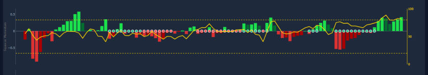
2. Squeeze Momentum Indicator
This indicator typically sits below the price chart and visualizes the momentum associated with the consolidation phase.
The Dots:
- Red/Black: The Squeeze is Active. Volatility is compressed. Traders often interpret this as a setup phase rather than an entry phase.
- Green/Gray: The Squeeze has Fired. Volatility is expanding, indicating that a directional move is underway.
The Histogram (Bars): This displays the direction of the momentum.
Bars below zero: Bearish momentum (Downward pressure).
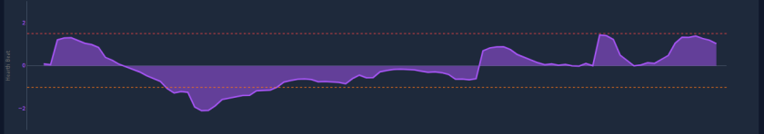
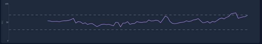
3. Heartbeat Chart
The “Heartbeat” indicator measures market activity levels independent of price direction.
- Active Heartbeat: Spikes or active colors indicate high market activity. This suggests sufficient liquidity and participation, which is generally preferred for trade execution to minimize slippage.
- Flatline: A flat or low reading indicates low activity. In this state, price action may lack conviction, and standard trend indicators may generate lower-probability signals due to the lack of volume.
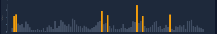
4. Volume Chart
Volume is the validation metric for price movement.
- Validation: If price breaks a resistance level (e.g., R1) accompanied by high volume, the breakout is technically considered to have higher validity.
- Divergence Warning: If price rises while volume bars decrease, it indicates a Volume Divergence. This suggests the trend is not supported by increasing participation and may be prone to reversal.
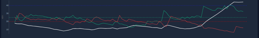
5. ADX Chart (Average Directional Index)
The ADX quantifies Trend Strength rather than direction. It functions as a filter for strategy selection.
- Below 20-25: The market is weak or ranging (non-trending). Trend-following strategies are statistically less effective in this zone.
- Above 25: A trend is present. The higher the value, the stronger the directional trend (applies to both uptrends and downtrends).
- Above 50: The trend is extremely strong, though values this high can sometimes precede exhaustion (parabolic climaxes).
6. RSI Chart (Relative Strength Index)
The RSI is a momentum oscillator used to identify the speed and change of price movements.
- Overbought (>70): The asset may be statistically overextended to the upside. Probability of a pullback or consolidation increases.
- Oversold (<30): The asset may be statistically overextended to the downside. Probability of a technical bounce increases.
- Divergence: A discrepancy between price and momentum.
- Example: Price makes a Higher High, but RSI makes a Lower High. This is a Bearish Divergence, often signaling waning momentum and potential reversal.
⚠️ RISK WARNING & AI DISCLOSURE
- This information is generated by Artificial Intelligence (AI) and complex algorithms. While advanced, these systems can contain errors or inaccuracies and are for educational purposes only.
- Technical analysis provides no guarantees; this information is purely informative.
- All discussed scenarios are hypothetical and do not constitute predictions or expectations.
- Past performance is not an indicator of future results.
- This is not financial advice and is not intended as a call-to-action for the reader.
- No implicit direction is claimed, and no specific behavior of market participants is suggested.